How CrewPulse works
Two data sources. One view. One weekly digest that tells you where to pay attention — and why.
Engineers check in — no login required
Every week, each engineer gets a short link by email or Slack. One click, five sliders, an optional text field. About 90 seconds total.
No app to install. No account to create. No password. The barrier is as low as it gets — which is why response rates stay high.
Five dimensions, five sliders
- · Satisfaction & wellbeing
- · Blockers & friction
- · Priority clarity
- · Workload sustainability
- · Team communication
Plus an optional open text field — AI-summarized into themes, not surfaced verbatim. Engineers are told upfront: the raw text is never shown to their manager, only AI-summarized themes. That's why they actually answer honestly.
These five dimensions map to the SPACE framework (Forsgren et al., 2021) — the same research behind DORA metrics.
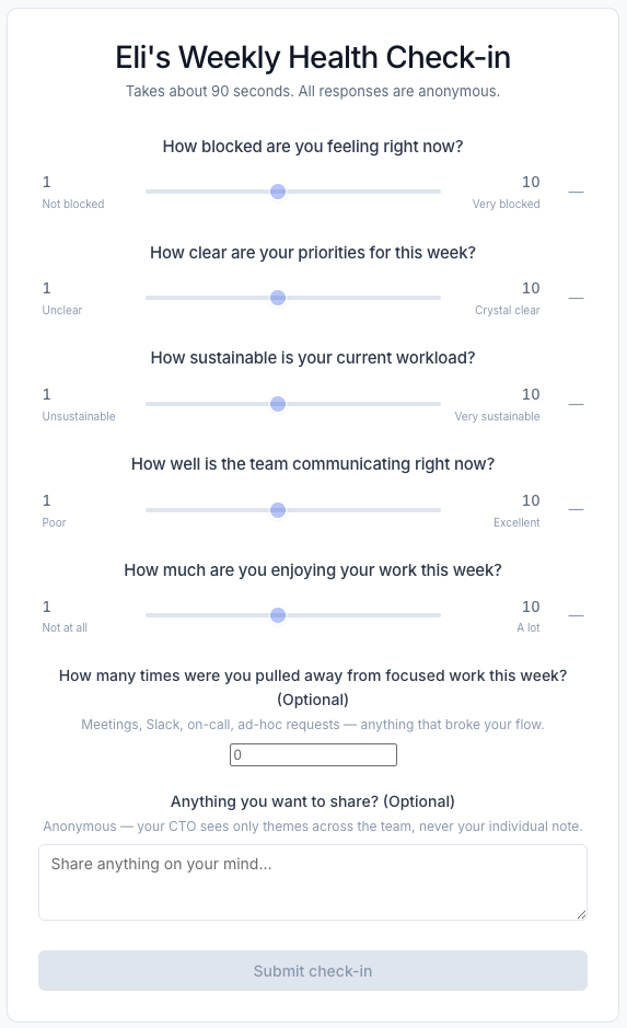
What an engineer sees — arrives by email, no login required
Delivery signals meet health data
Pulse data alone tells half the story. When you connect a delivery integration, CrewPulse joins the two halves — giving you predictive metrics that show where delivery is heading, not just where it's been. A team quietly flagging burnout while their numbers look fine is next week's blowup.
Delivery signals (optional integrations)
- · GitHub — PR review lag, cycle time, open PRs without reviewers
- · Jira — milestone slippage, sprint burndown, blocker age
- · Linear — project progress, cycle time
- · Azure DevOps — work item aging, PR status
Health signals (from check-ins)
- · Team pulse score (0–100, week-over-week trend)
- · Blockers: % of team flagging feeling blocked
- · Workload sustainability rating
- · Priority clarity rating
- · Communication quality rating
- · AI-summarized themes from open text
Integrations are optional
You don't need to connect GitHub or Jira to start. The pulse check-in works standalone and gives you health signal from day one. Delivery integrations add the second half when you're ready.
How delivery signals become a score
Raw GitHub and Jira data isn't useful by itself. CrewPulse translates it into a Delivery Pulse score — a 0–100 number per team, updated weekly, benchmarked against DORA performance levels. You see momentum, not just a snapshot.
Velocity signals
How fast work is actually moving through the team — from start to done. Benchmarked against DORA performance levels so you know what fast actually looks like for a team your size.
Predictive metrics
Work that's piling up, waiting on someone, or stuck — before it becomes a missed milestone. The early warning signs that don't show up in cycle time until it's too late.
Delivery Pulse — example output
Backend team
Teams in the at-risk or critical tier appear in your Monday digest with a plain-English callout explaining the specific signal that drove the score — not just that something is wrong, but what to look at.
You get a plain language digest every Monday
No dashboard to check. No chart to interpret. Just what needs your attention — and why — based on what changed since last week.
- ✓
Critical alerts first. Teams below the healthy threshold get flagged immediately, with the specific signals that drove it.
- ✓
Health + delivery in one read. Each team row shows pulse scores alongside Jira and GitHub signals — no tab-switching.
- ✓
Only what changed. Teams that are healthy don't appear. If everything is fine, the digest says so in one line.
- ✓
AI-summarized themes, not raw quotes. The open text from engineers is synthesized into plain English — the CTO sees patterns, not individuals.
- ✓
Delivered to your inbox or Slack. Get the digest where you already work. Discord delivery is on the roadmap.
The Monday digest — lands in your inbox or Slack, no login required
The dashboard, when you want to drill in
The digest is the default view — but the dashboard is there when you need more context. It's organized around teams, not metrics. When something looks wrong, you can ask why and get a plain English answer.
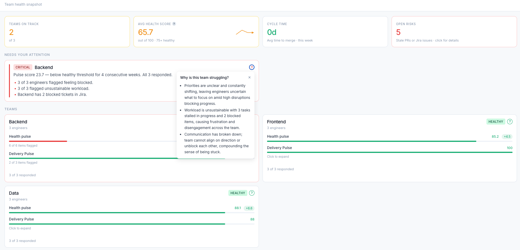
Top row gives you the at-a-glance read — teams on track, avg health score, cycle time, open risks.
Needs Your Attention surfaces teams in critical or at-risk territory with specific data points, not vague warnings.
"Why is this team struggling?" — click any team to get an AI-generated plain English explanation of what the signals are pointing to.
Up and running in 15 minutes
No implementation project. No IT ticket. Five steps and you have live signal.
Create your account
Self-serve signup — no sales call, no procurement process.
Add your teams
Name your teams and paste in a list of engineer email addresses. That's it.
Connect GitHub & Jira
Optional, but unlocks the delivery half. OAuth in two clicks — no tokens to manage.
Set your digest day
Pick the day you want your weekly summary to land. Most CTOs pick Monday morning.
View your dashboard
Check-in invites go out automatically. Your first pulse data lands within the week.
A team can be running within a day.
No integrations required. Just invite your engineers and the check-ins go out Friday afternoon.